Full-Service Website Design and Management for Small Business: 5 Options
Your website isn't just a digital storefront; it's your ultimate sales tool! But what sets apart the great from the merely passable regarding B2B SaaS website design? Join us as we uncover the secret sauce behind exceptional design and reveal some noteworthy examples to inspire you!
Imagine this: you've got a game-changing SaaS solution primed for the world. Your team is a blend of tech wizards and creative geniuses, and your product is poised for success. How can you set yourself up for success and make sure your website can capture the attention of your target audience?
This post will offer you five examples of incredible B2B SaaS website design. For each example, we’ll talk about why it’s great, then give you some actionable tips you can use to replicate its successes on your own website.
Let’s examine each component of a great B2B SaaS website:
- User-Centered Design: Your website should prioritize user experience. Create a design that's intuitive, easy to navigate, and focused on meeting the needs of your target audience.
- Clear and Concise Messaging: Leave the fluff and jargon at the door. Your messaging should be crystal clear. Visitors to your site should immediately understand what your product or service does and how it can benefit them.
- Mobile Responsiveness: In today's mobile-driven world, a site that runs well on mobile is a must-have. Your site should look and function just as well on a smartphone or tablet as it does on a desktop.
- Simple Navigation: Don’t hide the goods from your potential customers! Instead, make it easy for users to find what they want. A well-structured menu and intuitive navigation can help users find what they need and stay on your site longer.
- Consistent Branding: Consistency is key. Ensure that your branding, including colors, fonts, and voice, is consistent across your website. This consistency builds trust and reinforces your brand identity.
- SEO: Search engine optimization is crucial for visibility. Use relevant keywords, optimize meta tags, and create high-quality content to improve your website's search engine rankings.
- Analytics: Implement robust analytics tools to track user behavior on your site. This data provides valuable insights into what's working and what needs improvement.
- Strong Buyer Journey: Craft a well-defined buyer journey that guides visitors from awareness to conversion. A clear path with compelling calls to action is critical in boosting your conversion rates.
These components are all essential to crafting a B2B SaaS site that converts like crazy. You may be asking, do I really need to have ALL these elements? The answer is… absolutely. If you’re missing any of these components — particularly the buyer journey — you risk losing potential customers at various stages in their decision-making process.
Case Study: How A Website Redesign And Buyer Journey Overhaul Dramatically Increased Conversion Rates Across The Board
Some potential consequences include:
- Lost Leads: Visitors may arrive at your site but leave without engaging or converting because they couldn't find the information they needed or weren't guided effectively.
- High Bounce Rates: A poorly designed buyer journey can lead to high bounce rates, indicating that visitors leave your site quickly without exploring further.
- Negative Brand Perception: A confusing or frustrating website experience can tarnish your brand's image, making potential customers question your credibility.
- Missed Opportunities: Your competition may provide a smoother, more guided experience, which means you risk losing potential customers to competitors who understand the importance of a strong buyer journey.
With all this in mind, let’s dive into some top examples of incredible B2B SaaS websites, giving you everything you need to draw inspiration for your site redesign!
1. HubSpot
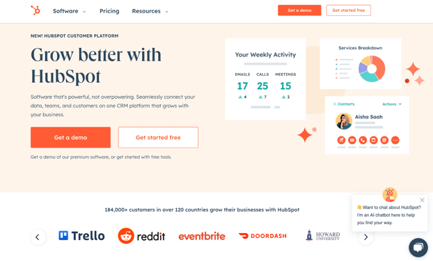
HubSpot is a CRM platform that caters to businesses of all sizes. HubSpot’s suite of tools and integrations allow businesses to manage marketing, sales, customer service, and more. Some of HubSpot’s most prominent customers include Reddit, DoorDash, and Weight Watchers. The platform comprises six core products: Marketing Hub, Sales Hub, Service Hub, CMS Hub, Operations Hub, and Commerce Hub, all connected to a unified CRM database.
Related Read: Websites Built With HubSpot: 6 Best Examples You Can Model Today
Standout Site Features
HubSpot’s site design is clean and easy to navigate. Let’s take a closer look at some of the things they’re doing well — and how you can steal their strategies for your own site.
- Simple Navigation: HubSpot has only three items in its main navigation bar. Though they offer a whole suite of tools and solutions, the simple navigation bar speaks to the simplicity of their tools. Instead of overwhelming a site visitor with options, boil down your offerings to their simplest level, then provide those options alone in your navigation bar.
- Strategic CTAs: HubSpot’s two main CTAs on their homepage offer visitors a demo and the option to create a free account. By offering two no-cost entry points into their sales funnel, HubSpot maximizes their chances of capturing those leads regardless of where they are in their buyer’s journey.
- Social Proof: HubSpot’s home page includes a scroll of their most high-profile clients and customers. Sharing these recognizable logos on their homepage increases the trustworthiness of HubSpot in the eyes of casual site visitors. Even if you don’t have big-name clients, you can share testimonials or reviews of your solution to leverage for social proof.
2. ConnectPay
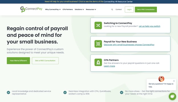
ConnectPay offers tailored payroll solutions for small businesses. With a focus on personalization and local expertise, ConnectPay distinguishes itself from other providers by offering seamless integration with services like CPA, QuickBooks, worker's comp, and 401k. ConnectPay’s unique offering is its ability to connect businesses with local experts in taxes, workers’ compensation, and more.
Standout Site Features
ConnectPay’s website is sleek and informative. Let’s dive into their strengths and show you how to leverage them for your website.
- Focus on Differentiation: ConnectPay operates in an industry infamous for poor customer service. Many of the people visiting their site will have been burned by a previous payroll provider, so ConnectPay offers the option for visitors to see what makes them unique with the “How We’re Different” button. You can leverage this approach by understanding your customers’ pains and worries and addressing them head-on on your homepage.
- Targeting Multiple Audiences: ConnectPay serves both small businesses and partners with CPAs. Their homepage communicates this clearly by offering options in the navigation bar and the hero module for CPAs and small businesses. A word of caution for this approach, however — don’t try to target too many subsets of your audience simultaneously.
- Free Offers: Like HubSpot, the CTA on ConnectPay’s homepage offers visitors something for nothing! You can get a free consultation, and ConnectPay advertises this with CTAs in the navigation bar and the hero section. Offering a free consultation is especially effective if, like ConnectPay, your audience is slow to trust providers in your industry.
3. Cimcor
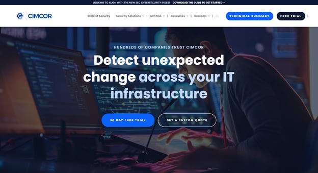
Cimcor offers comprehensive IT infrastructure security solutions. The platform mitigates cybersecurity threats like human error, zero-day attacks, ransomware, and Zero Trust issues. Their solution, CimTrak, protects a wide range of systems, including servers, workstations, network devices, directory services, databases, POS stations, and file systems, ensuring continuous compliance with standards like CMMC, PCI-DSS, GDPR, HIPAA, and Sarbanes-Oxley.
Standout Site Features
Cimcor’s homepage conveys the seriousness of their brand’s promise through striking visuals and strong text. Let’s explore how you can use some of their approaches to make your website shine.
- Personalized Live Chat: All of the examples in this post have a ChatBot on their homepage, but I wanted to call out the chat feature on Cimcor’s page specifically because Cimcor has cleverly inserted the headshots of two team members above the chat icon. Even if your chat feature is a ChatBot, including images of your team on the chat feature makes it more personalized and gives a human touch to your home page.
- Industry Insights: The first option in Cimcor’s navigation bar is “State of Security.” This page includes a deep dive into the challenges businesses face regarding cybersecurity in the modern market. The page does double-duty for Cimcor, establishing them as a trusted resource in the industry while also providing context for why their solution is different (and better). Adding a page like this to your website can help warm up the coldest visitors who find their way to your site.
- Let’s Get Technical: Cimcor knows their audience — they’re speaking to CTOs and other similarly technically-minded professionals. Though the language on their website is free of jargon, they offer an in-depth technical summary as a CTA right in their nav bar. If your audience is the type to love the nitty-gritty details, you may want to consider a similar approach on your site.
4. MailChimp
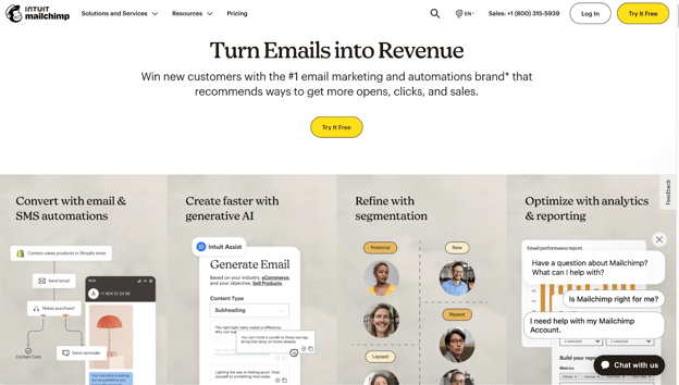
Mailchimp is a leading email marketing and automation brand that offers businesses the opportunity to win new customers and boost revenue through personalized email and SMS automations. Their platform utilizes generative AI tools to create on-brand content. You can also use Mailchimp to segment your audience based on various criteria, including spending habits and buying behavior. Mailchimp also offers comprehensive analytics and reporting to track email performance, including custom reports and industry benchmarking.
Standout Site Features
Mailchimp’s homepage gets right to the point and promises customers results. Let’s break things down and show you how to use some of these tactics for your site.
- Selling the Hole: I’m playing on an old marketing adage here — the one about people not wanting to buy a drill; they want the hole. Mailchimp’s hero text gets right at the heart of what their customers want — to turn emails into revenue for their company. What do your customers want? I mean, what do they really want? Don’t bury the lede; put that promise big and bold on your homepage.
- Feature Breakdown: Mailchimp’s solution is capable of doing a lot of different things. They’ve broken down the four main segments, marketing automation, AI tools, audience management, and analytics, directly underneath the hero section. Placing all these features side-by-side is visually appealing and allows visitors to easily drill deeper into the feature they need most. Remember, however, that no one cares about a feature list — instead, focus your copy on what those features can do for your customers.
- Simple CTAs: Mailchimp hasn’t cluttered their page with multiple CTAs and offers. Instead, they have one offer — to try their product for free. If your product has a freemium model or a free trial, you may choose the same approach for your site.
5. Zendesk
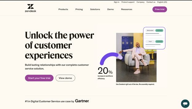
Zendesk offers a comprehensive customer service solution to help businesses build lasting customer relationships. The platform provides tools for personalizing conversations, anticipating requests with AI, adapting to changing needs, and making data-driven decisions. Zendesk's service is backed by the experiences of global brands like Thrasio, Wine.com, Khan Academy, and ZeroFox, highlighting its flexibility, integration capabilities, and ability to meet and exceed customer expectations.
Standout Site Features
Zendesk’s site blends form and function, giving us an attractive site poised to convert. Let’s take a look at why — and show you how to replicate it.
- Embedded Videos: Zendesk includes a walk-through product tour of their main support features and integrations on their homepage. Their audience wants to see how this tool can transform their processes, and allowing them to see the tool in action is one of the best ways to accomplish that. You may want to explore this approach if you are a tech and SaaS company. A word of caution, however: if your UI isn’t particularly attractive, you won’t want to use this approach.
- Expanding Menus: Zendesk offers two main solutions, an application for sales and an application for customer service. Rather than listing both in their main navigation, Zendesk nests both under the “Products” option. When hovered over, the “Pricing” navigation field also splits into two choices, one for service and one for sales. This approach works well, allowing for simple, smooth navigation without muddying up the navigation and homepage and making the solution appear disjointed. If you offer a suite of tools, target multiple audiences, or have multiple solutions available, you may want to consider this for your navigation bar.
- Effective Graphics: Visuals aren’t everything, but they are certainly one piece of the puzzle regarding great B2B SaaS website design. Zendesk’s hero graphic does double duty by offering a clean, professional image and providing a statistic stating that their solution can result in a 20% increase in workforce efficiency. You might consider including a compelling statistic like this in your graphics if you have one.
Getting the Most From Your B2B SaaS Website Design
Examining the examples listed in this post can help you kick off your journey to better website design for your B2B SaaS brand!
Remember that great website design is about more than aesthetics: A high-converting website uses aesthetics to support the buyer journey baked into the navigation, copy, images, and more!
These examples can help you start off on the right foot, but if you want to create a website that can help you attract the right audience and 10X your leads, you need more than examples: you need a guide.
Our free resource, the Website Transformation Toolkit, can show you how to turn your website into your number one salesperson! Check out the toolkit today and get started building your conversion machine.
Tags:

Jan 31, 2024


